
Your brand isn’t old. It just stood still.
A ten-year-old logo is rarely the real problem. A website, a quote and a LinkedIn page that each tell a different story are. How to find out what has actually aged, and how new tools help you choose faster.

Dated feels different from how it looks
Few business owners say: our logo is outdated. They say: I’d rather not send people the link to our website. Or: everyone on the team makes their own quote template. Those are the real signals. A brand rarely ages all at once; it fragments. The colours on the van no longer match the ones on Instagram, the tone of your emails is more formal than the company itself, and new customers describe you differently from how you would describe yourself. So a refresh doesn’t start with a new logo, but with the question of where the picture people get of you no longer matches who you are today.
I’d rather not send people the link to our website.
Everyone makes their own quote template.
Customers describe us differently than we do.
Start with what should stay
Lay out everything where your brand is visible: business card, invoice, email signature, website, social media, workwear, the sign on the building. Then look first at what people recognise. It might be a colour, the way your name is pronounced or a phrase customers repeat back to you. That recognition took years to build and is valuable. For each item, decide: keep, refine or replace. Often a brand doesn’t need a revolution, just a sharper version of itself. Customers then mainly notice that everything fits together better, not that they have to get to know you all over again.
Fictional example. This turns a refresh into a series of small decisions instead of one big leap.
Let the machine sketch, not choose
This is where AI tools genuinely help. Where a designer once needed days for a handful of directions, you can now produce dozens of variations in an afternoon: colour combinations, moodboards, tone-of-voice samples, name ideas. That makes an abstract conversation concrete. ‘Something fresher’ suddenly becomes ‘this one yes, this one no, and here’s why’. Use that speed to explore, not to decide. Generated proposals tend towards the average of everything that already exists; you stand out precisely through the choices a tool doesn’t make for you. Treat the output as a pile of sketches on the table, with you and your designer as editors.
Dozens of colour combinations side by side
Moodboards for different directions
Sample copy in different tones
A long list of name ideas
Which direction suits your company
What you keep from the current brand
Rights, registration and source files
The final version of the logo
What you don’t leave to a tool
A logo made by a tool isn’t automatically unique or protectable. Check that no similar brand exists in your industry and read the tool’s terms on use and rights. Have the final mark rebuilt as a vector file, so it stays sharp at every size and you own the source files yourself. Be careful with confidential information in prompts, such as client names or plans you haven’t announced yet. And test colours for legibility: a beautiful combination on a moodboard may not have enough contrast as a button colour on a website.

Test the brand in real work
A new brand always looks good on a presentation slide. The real test is everyday use. Put it on an invoice with long amounts, in an email signature next to an ordinary photo, on a LinkedIn post with an awkward image and as a tiny icon in a browser tab. Look at it in black and white, on a dark background and on a phone in the sun. Show a few regular customers the old and new versions without explaining what changed. If they ask what’s different but recognise you straight away, you’re usually in good shape.
Refresh in layers, not overnight
You don’t have to replace everything at once. Start with what is digital and quick to change: website, social media profiles, email signatures and templates for quotes and presentations. Print and signage follow when they need replacing anyway. Record your choices in a short brand guide with colours, typefaces, examples and what you deliberately don’t do, so colleagues and suppliers can carry on by themselves. Tell customers mainly why you’re refreshing, not just what is changing. The best way to show a brand that is moving again is to use it consistently.
What a brand guide looks like
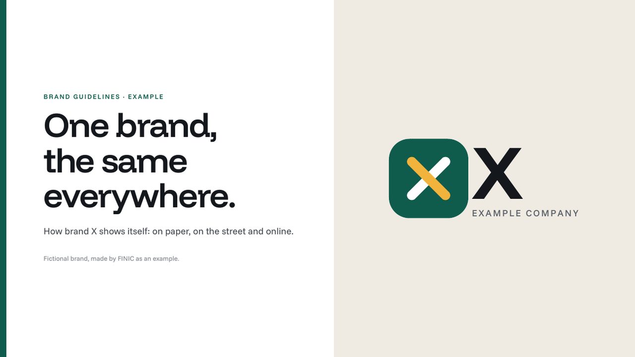
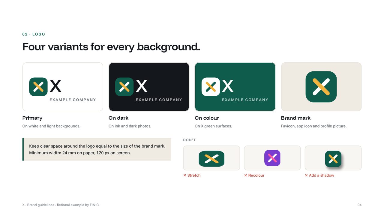
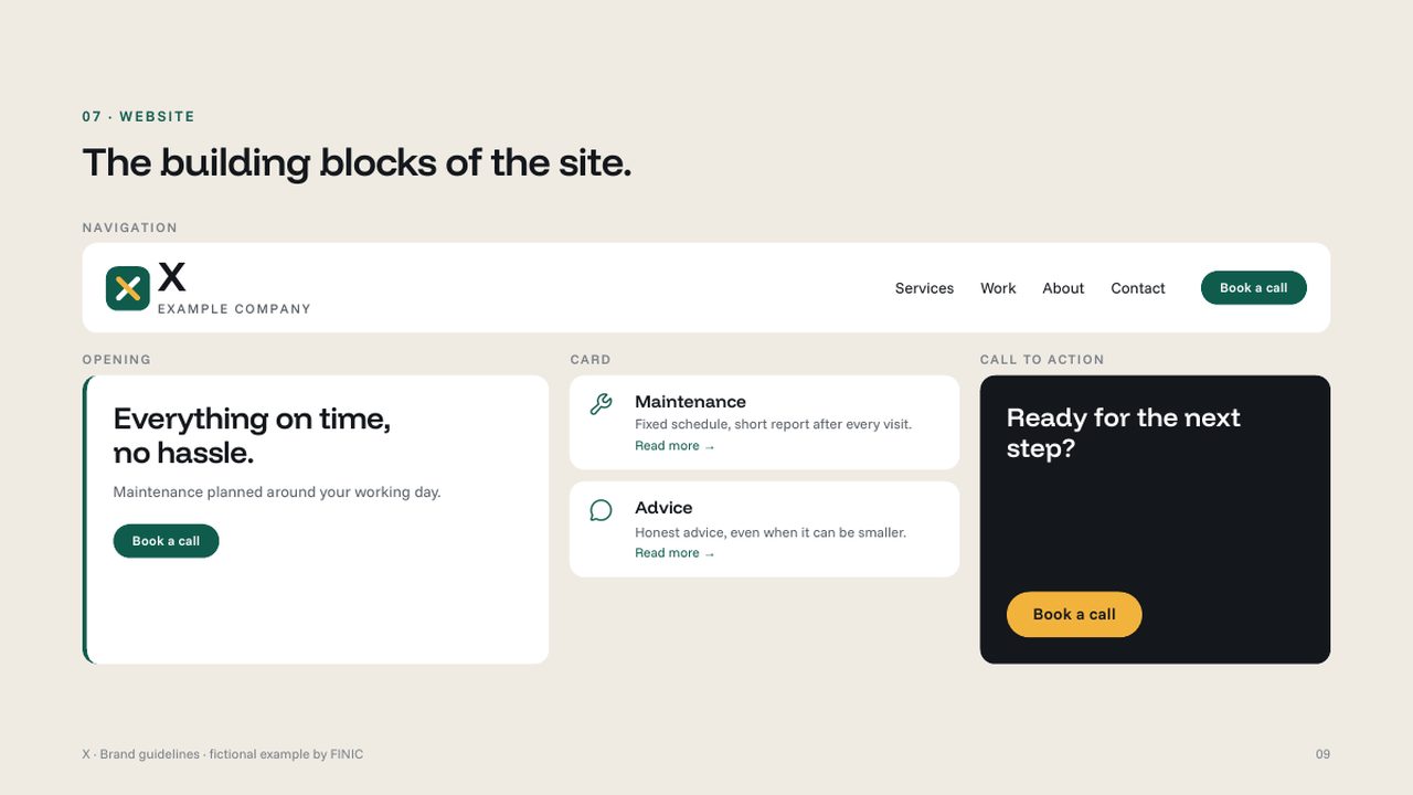
Logo, colours, typography, applications and the building blocks of the website, in one place. Made for the fictional brand X, so you can see what you get after a refresh.
 Email hosting
‘Your quote was in my spam folder.’ Not something you want to hear. Whether an email lands in the inbox is decided by the recipient, based on who you are, how you send and what you write. Here’s how to make your domain vouch for you.
Read article Email hosting
Read on your phone, but still bold on your laptop? Or a sent email you can only find on one device? With IMAP you see the same thing everywhere. Here’s how to set it up in the apps you already use.
Read article