

Give your website a better first sentence
Your visitor doesn't know your business yet. A clear promise, visible proof and a logical next step help far more than a homepage full of big words.
Start with your visitor's situation
‘We are an innovative partner with a passion for quality.’ It sounds professional, but you could put almost any company name above it. A visitor still has to work out what you do and whether it's relevant to them. Start instead with the work you make easier for someone. A fictional building services company might write: ‘Maintenance for your business premises, planned without bringing your working day to a halt.’ That makes the offer concrete. The rest of the page then has to show how the company keeps that promise.
We are an innovative partner with a passion for quality.
Maintenance for your business premises, planned without bringing your working day to a halt.
Let your page tell one story
A homepage doesn't need to say everything about your organisation at once. First help someone understand who you work for and which problem you solve. Then show your approach and a relevant example. Only once that foundation is clear does more depth about services or technology start to mean something. Read the subheadings one after another, without the paragraphs below them. Together they should already tell an understandable story. If you say in three places that you're committed, there's probably room for more concrete information about collaboration, delivery or support.
Make quality visible
‘We deliver quality’ asks for trust without showing anything. A worked-out project gives a visitor more to hold on to: what was the situation, which choice did you make and what can the client do now? Where possible, show the result with a product photo, an interface or a clear description of what was delivered. Only use results and client quotes that you can back up and are allowed to publish. If you don't have a suitable case yet, a clearly labelled demo can show your approach. Just present it as an example, so visitors know what they are looking at.



Say what happens after the click
A button that says ‘Submit’ tells people very little about what to expect. ‘Book an introductory call’ is more concrete, provided the next page actually helps them book it. On a form, explain what you use the information for and what the next step is. Only ask for details you need at that moment. People who are still exploring may first want an example or an explanation of how you work. Give that depth a place without filling every page with equally eye-catching buttons. One clear main action helps visitors choose.
Test the whole route on your phone
Open your website the way a new visitor would and try to complete a real task. Find a suitable service, look at an example and get in touch. Watch for text that gets cut off, buttons that are hard to tap and forms that wipe everything you typed after one error. Try the route using only the keyboard as well. Check whether labels make sense and whether you can see where the focus is. A beautiful design loses its value when the most important action is unnecessarily difficult.
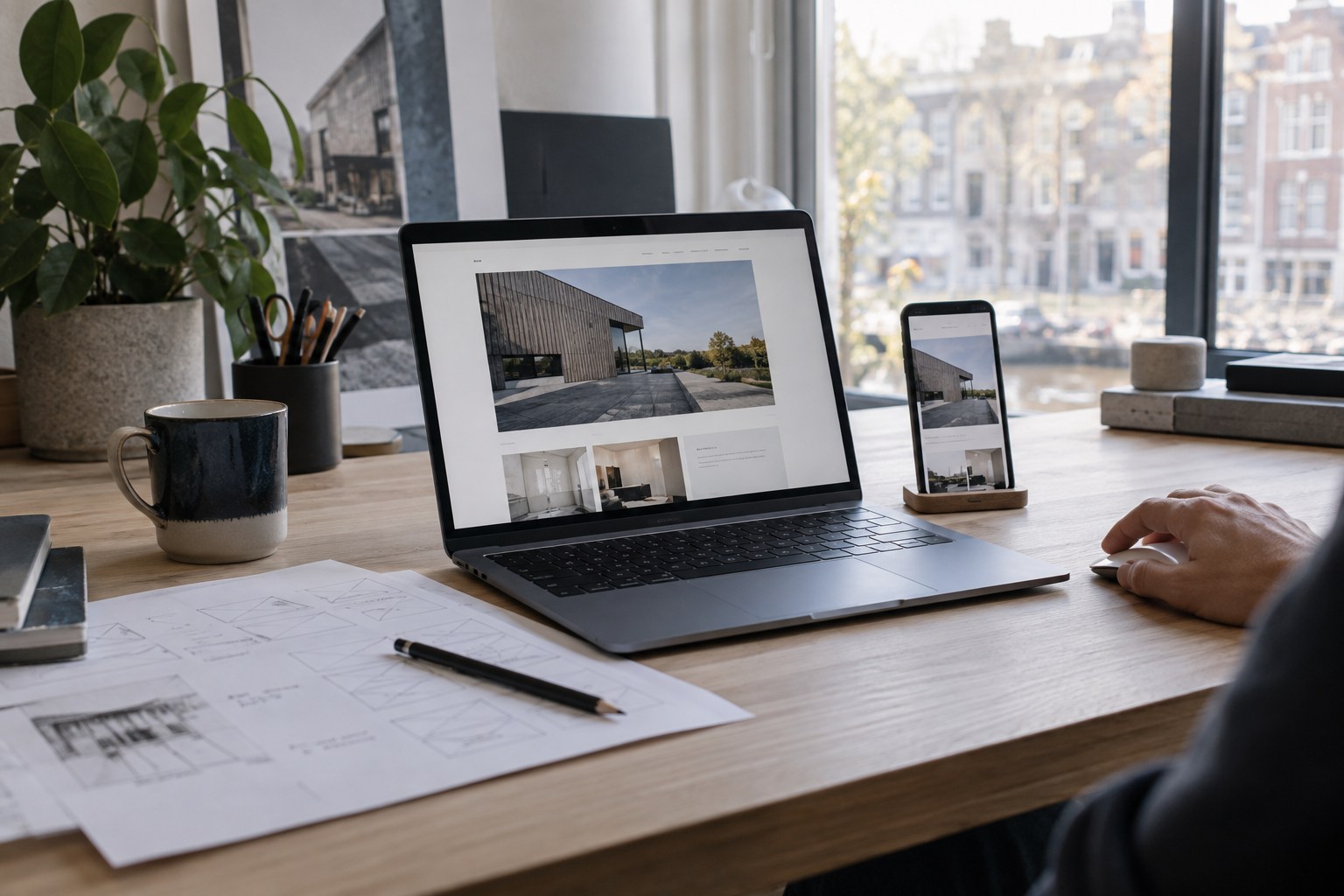
Improve one page with a clear goal
Start with a page where visitors make an important choice. Rewrite the opening, add one strong piece of proof and make the next step clearer. Ask someone from your target audience to tell you what they think you offer, who it's for and what happens after the click. Listen especially for doubt and misunderstandings. Afterwards, check whether enquiries match your offer better. More clicks alone mean little if people get in touch with the wrong expectations. A good website helps both sides see sooner whether there's a match.
 Custom software
An extra tab solves a lot. Until nobody knows which version is right and one colleague is holding the entire planning together. How to recognise a process that is ready for better software.
Read article API integration
An order shouldn't have to travel through inboxes and spreadsheets. Clear agreements about data and errors are what make a system integration truly useful.
Read article