Visual identity
From loose choices to one recognisable style.
A colour here, a different typeface there: without a fixed visual identity, every document looks different. We get the choices right once and apply them straight away to everything your team uses every day.
Choose once, the same everywhere.
A visual identity is not a logo, but a set of agreements: which colours, which typefaces and how to use them. Because FINIC also builds websites, email and software, it doesn't stop at a PDF. We apply your identity ourselves, right down to your email signature and your Teams background.
What we deliver
Two or three directions
Based on a conversation about your business and your customers, we create moodboards. You choose by what you see, not by gut feeling.
Colour palette with fixed roles
Every colour gets a job: primary, accent, background. Tested for readability against the WCAG guidelines.
Typefaces for screen and paper
One for headings, one for body text, and we make sure they also work in Word and PowerPoint.
Agreements and application
A short overview of the agreements, and your identity applied straight away to your business card, LinkedIn, Teams, social media and email.
Example: the FINIC colour palette
- AaAAA15.6:1
Navy
#17233E
Primary colour
- AaAA6.2:1
Lavender
#A59BDF
Accent on dark
- AaAA5.8:1
Purple
#6B5C99
Accent on light
- AaAAA14.0:1
Paper
#F1F2F8
Light background
- AaAAA7.8:1
Ink
#080B14
Dark background
Typefaces
Funnel DisplayHeadings
Funnel SansBody text
Every colour has a fixed role. The number is the contrast with the text colour on top; from 4.5:1, text is easy to read according to the WCAG guidelines.
Example
/ 01
Logo set
SVG and PNG · wordmark and icon, light and dark
Every place asks for a different shape. On a small icon the wordmark is unreadable, so that is where you use the icon.
Light theme

 Icon
Icon App icon
 Favicon
 Profile picture
Dark theme

 Icon
Icon App icon
 Favicon
 Profile picture
/ 02
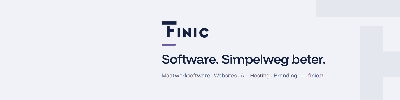
LinkedIn banner
1584 × 396 px
Your profile photo overlaps the bottom left of the banner. That is why the brand sits on the right.
Light theme
Dark theme

/ 03
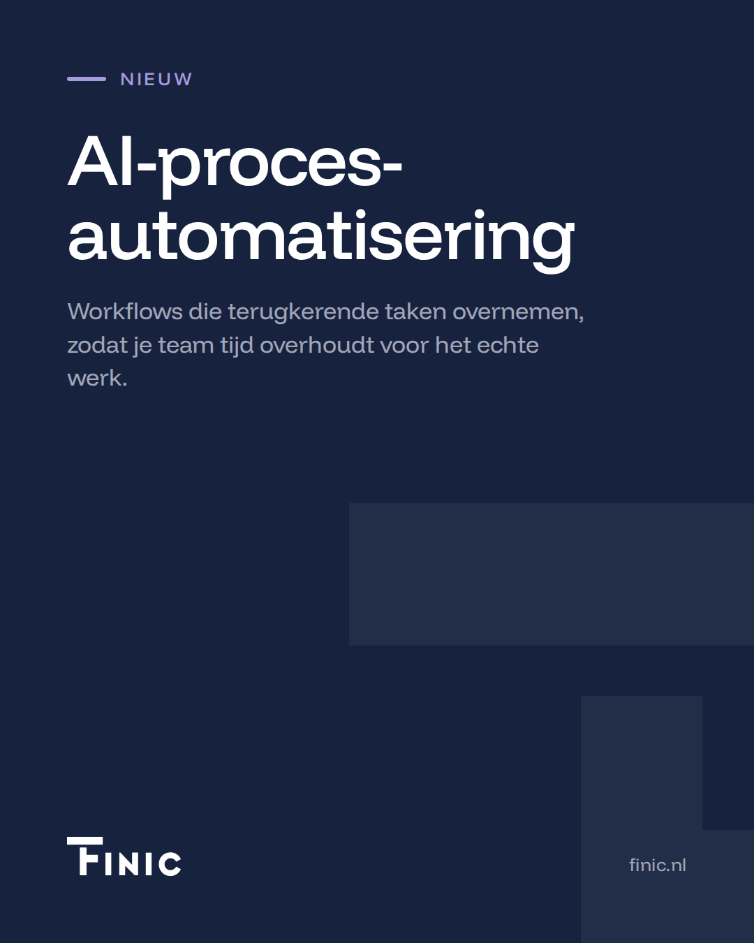
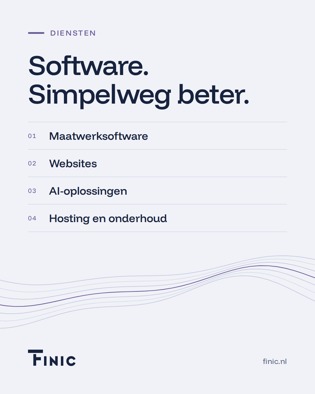
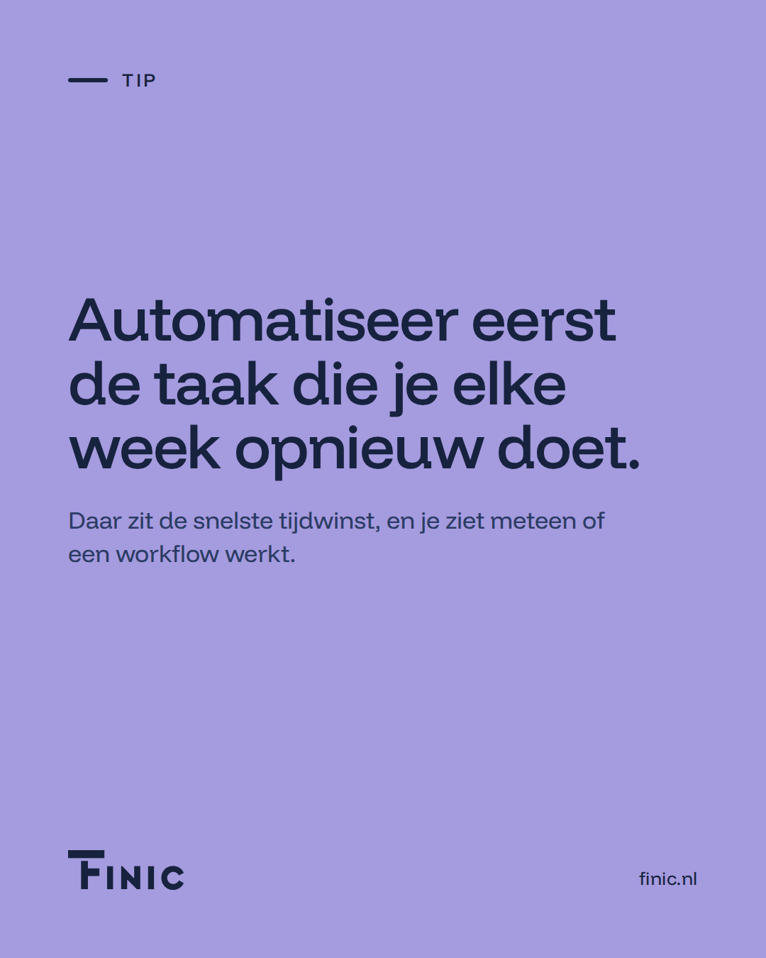
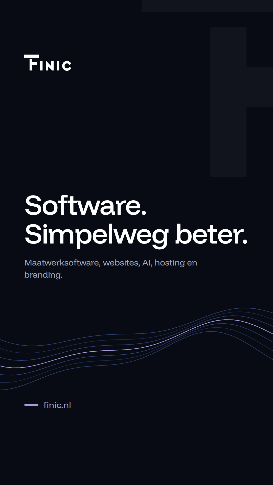
Social media templates
1080 × 1350 px post · 1080 × 1920 px story
A fixed layout with room for your own text, so every post is instantly recognisable.
/ 04
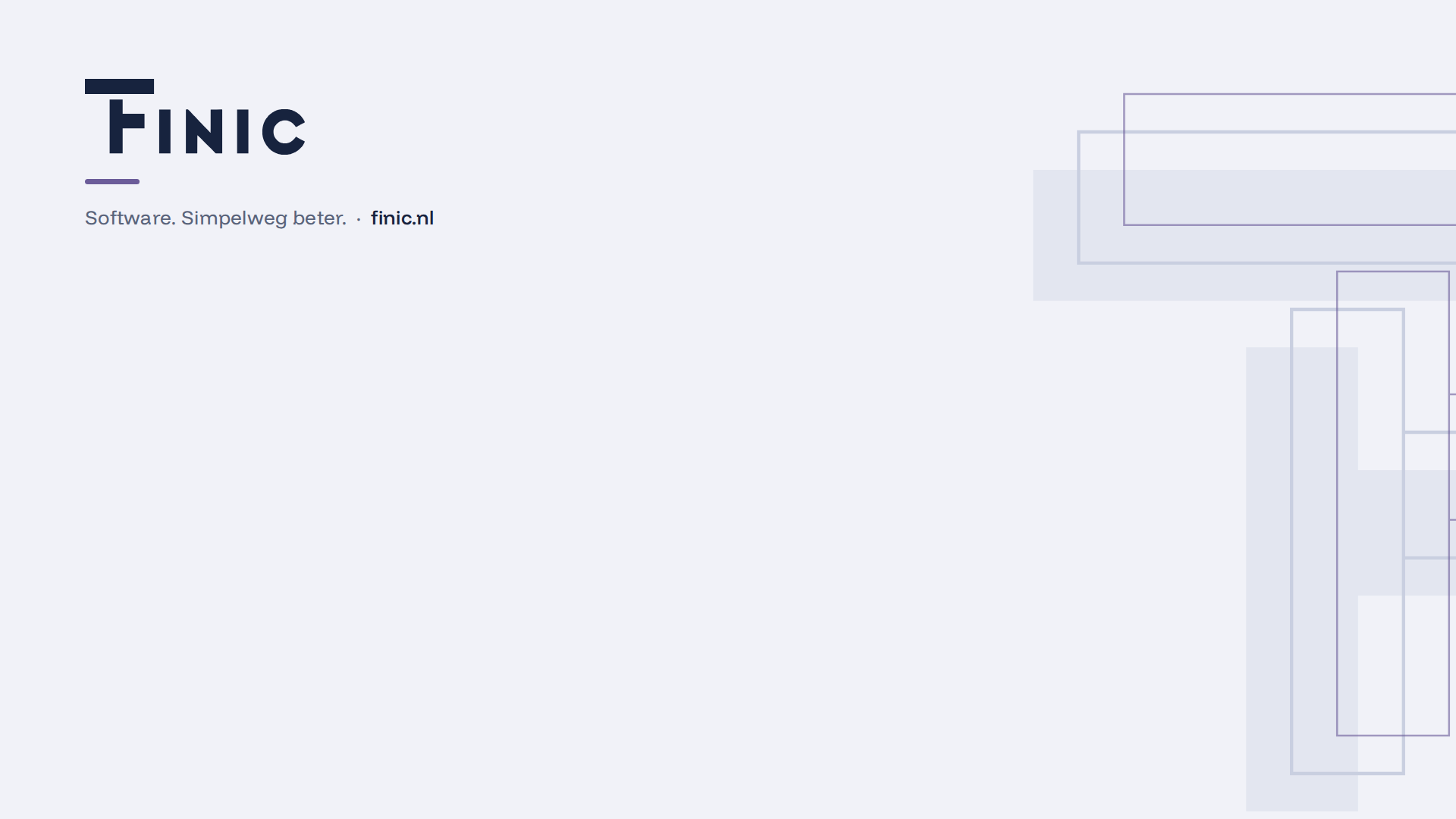
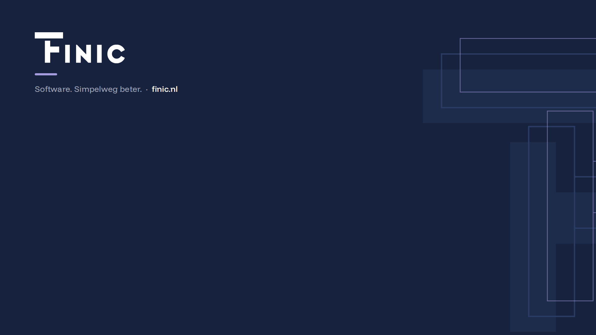
Teams and video background
1920 × 1080 px
In a video call you are in the middle. The brand sits on the left and the centre stays calm.
Light theme
Dark theme
/ 05
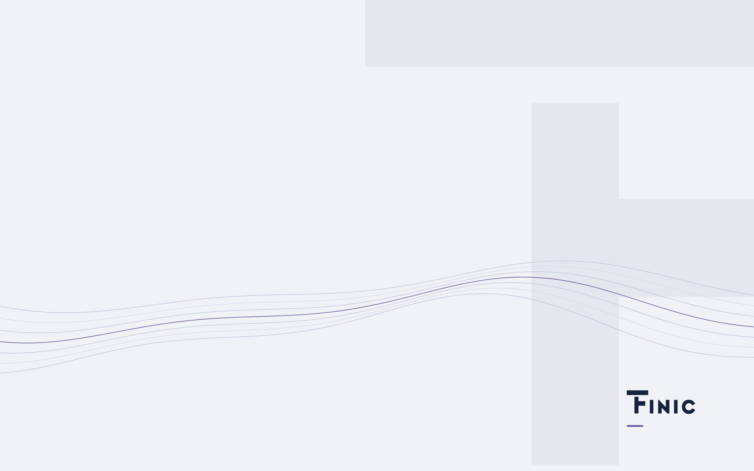
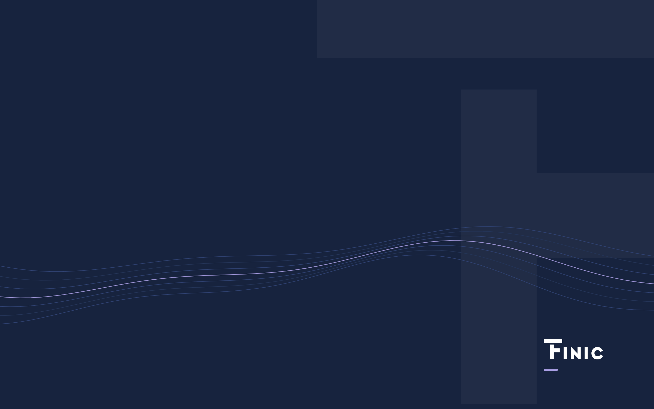
Desktop wallpaper
2560 × 1600 px · also for 16:9
Your desktop icons are on the left. That side stays calm, so they remain readable.
Light theme
Dark theme
/ 06
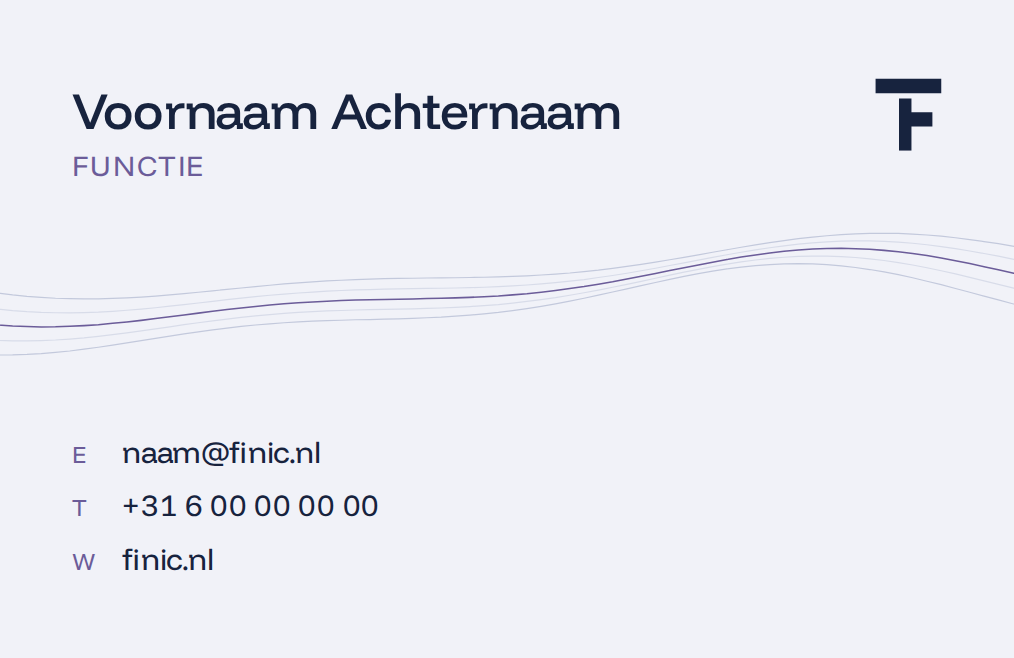
Business card
85 × 55 mm · print-ready PDF with 3 mm bleed
The front carries the brand, the back your details. You get a print-ready file, so the printer can get started right away.
Front

Back
/ 07
Company profile cover
A4 · 210 × 297 mm · print-ready PDF
The first page a client sees: the brand up front, calm, with room for the title.
Light theme
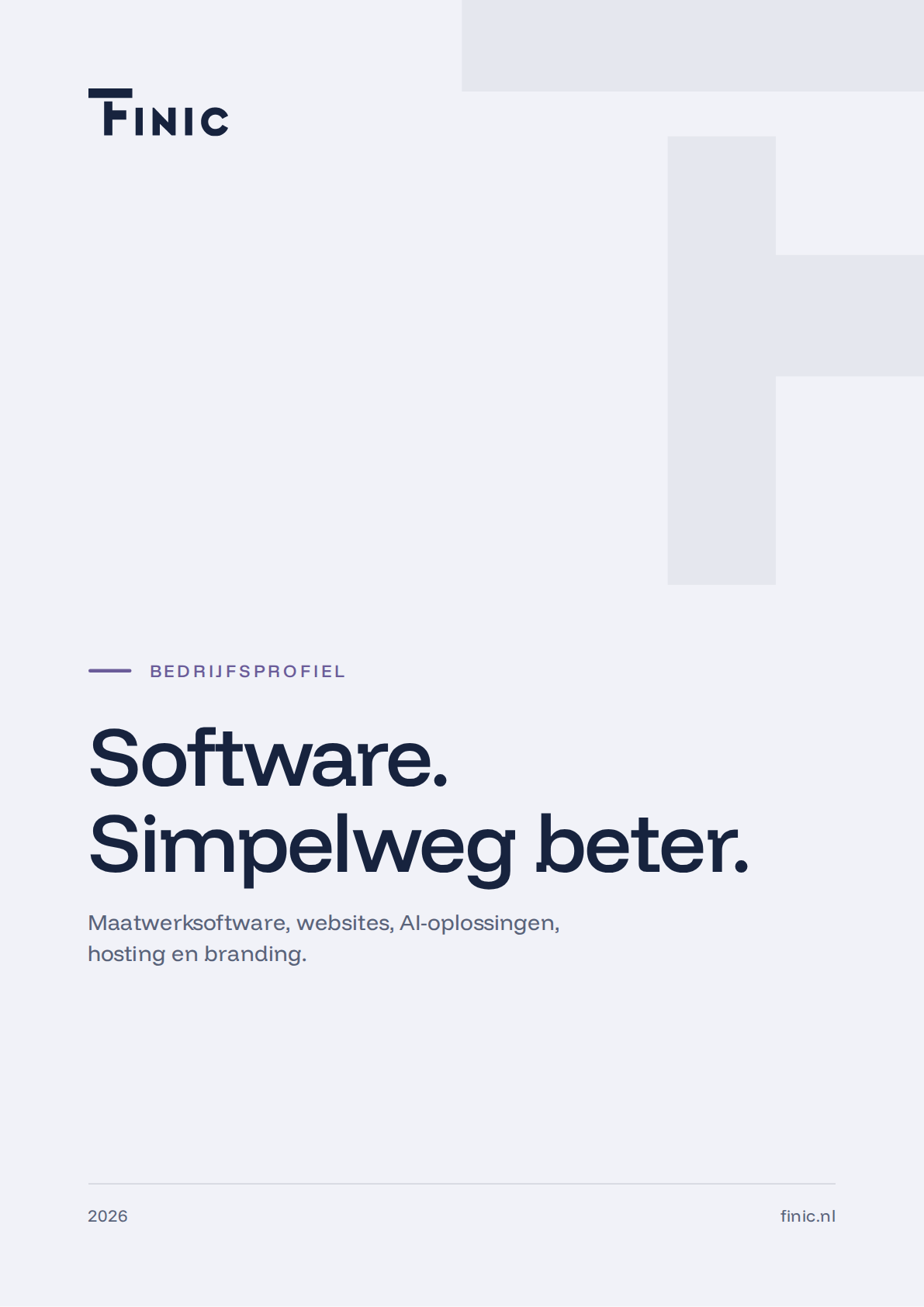
Dark theme
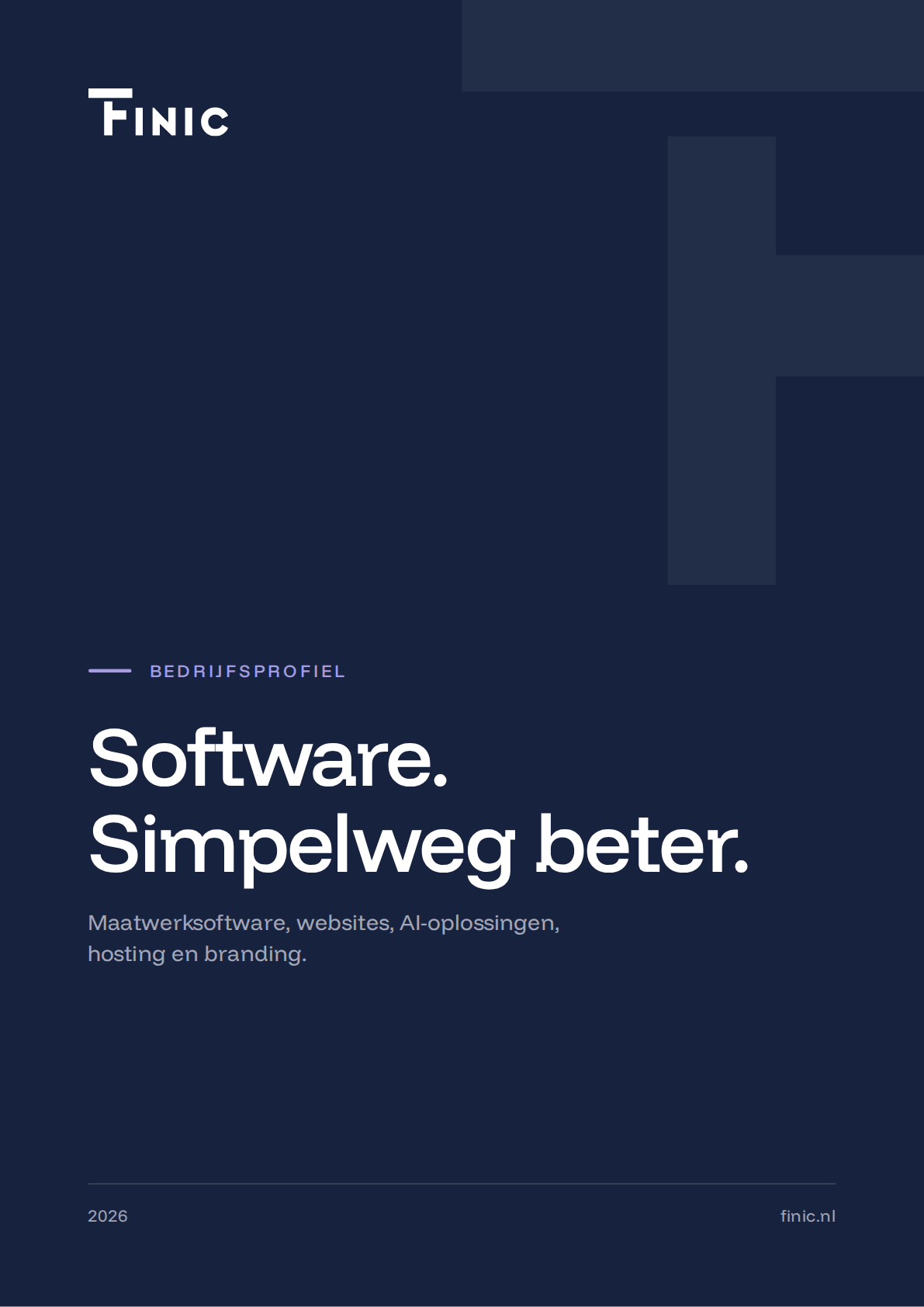
Examples in FINIC’s own house style. For your brand we make them in your colours and with your logo.
Example
A signature in our house style
This is what a signature in the FINIC house style looks like, with the details of a sample employee. For your team, we make it in your house style.
Kind regards,
 | First name Last name Job title
|
How your visual identity comes together
You always see a proposal before we build further. So you know where you stand at every step.
Getting acquainted
We discuss your business, your customers and what your brand should convey, and look at what is already there.
Choosing a direction
You receive two or three worked-out directions and choose one, with adjustments if needed.
Working it out
We develop the chosen direction into colours, typefaces and agreements.
Delivery and rollout
You receive all files, and we roll the identity out ourselves in your email, profiles and website.